
Blue is a clear winner for paint colors in 2027, with several major paint manufacturers choosing a shade of blue as their Color of the Year pick. Soft browns and beiges were also a popular option, bringing warmth into any room in the home. See a full roundup of all the Color of the Year picks announced so far.
PPG | Country Soil
Country Soil is a warm, saturated hue that blends beige, taupe and gray. Country Soil draws inspiration from the natural world, evoking clay-rich earth and weathered stone. The color is part of PPG’s 2027 global color theme, Foundations, which includes three palettes: Solid Ground, Quiet Zone and Life Shared.
“Country Soil is designed for slowing down,” says Irina Hanhisalo, PPG color category lead, EMEA, architectural coatings. “For 2027, we have selected a grounding color that acts as a solid foundation for any project. Inspired by the warm, natural hues of clay, it provides a base layer with a soft, neutral tone. Rather than treating wall color as a decorative surface layer, Country Soil creates a space to settle and recharge.”
California Paints | Quiet Peace
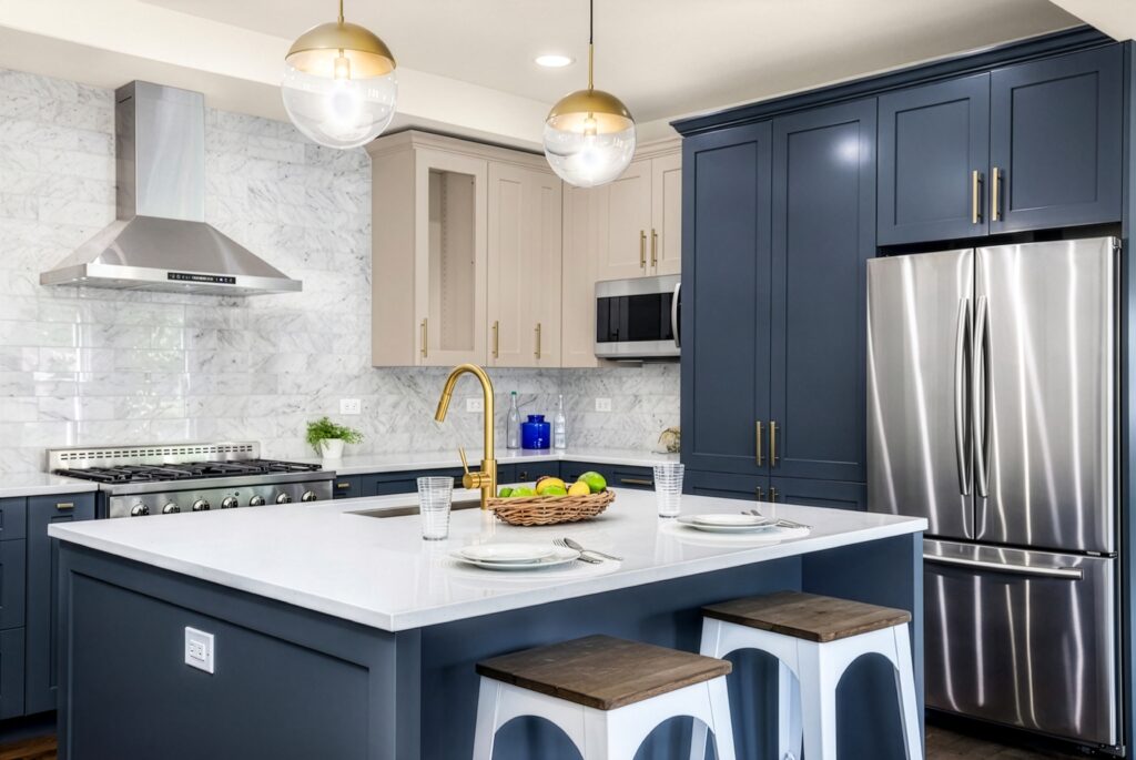
Quiet Peace, a deep, moody blue, evokes tranquility and calm at a time when homeowners and consumers are seeking it out more than ever before. Quiet Peace is a rich and enveloping color and is ideal for creating a serene atmosphere in living rooms, bedrooms, dining rooms and other interior spaces where peace is a priority.
“Consumers today are looking for connection, optimism, balance, humanity and joy in a world that can feel increasingly overstimulating and uncertain,” says Dani Doerge, marketing manager, California Paints. “Quiet Peace delivers on that need, offering serenity with a touch of the bold to help homeowners turn their spaces into a true retreat from the everyday.”
Clark+Kensington | Vantage Point
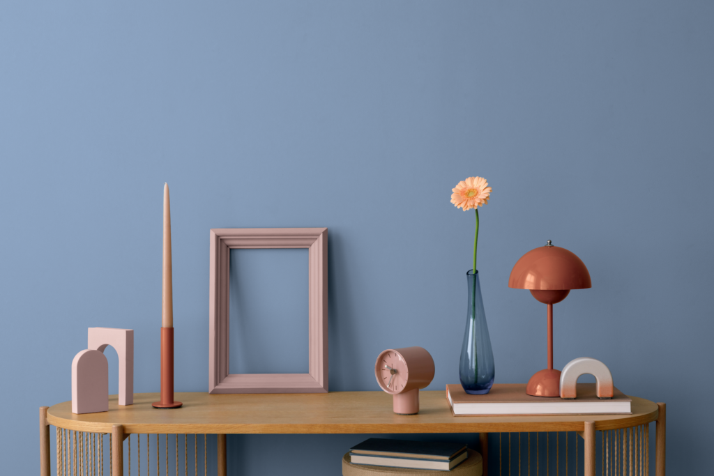
A sophisticated take on blue, Vantage Point adds depth and dimension to the 2027 Clark+Kensington Color Trends collection. Selected by color trend forecasting partner Colour Hive in collaboration with the Clark+Kensington design team, Vantage Point reflects a growing desire for interiors that feel both uplifting and restorative.
“Homeowners are looking for more moments of connection at home, and color can have a powerful impact on how a space makes us feel,” says Kim Lefko, chief marketing officer at Ace Hardware. “Vantage Point brings a sense of warmth and character to interiors, offering a versatile blue that feels fresh for 2027 yet timeless enough to live with for years to come.”
Sherwin-Williams and HGTV Home | Celery
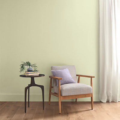
A soft, muted green with subtle yellow undertones, Celery offers a fresh perspective on comfort and calm, bringing a light and airy presence to interiors while encouraging a renewed sense of balance in daily life. The shared Color of the Year reflects both brands’ commitment to color leadership while strengthening their position as trusted resources for homeowners, designers and professionals seeking inspiration for the year ahead.
“Celery was chosen as the 2027 Color of the Year because it reflects today’s priorities: wellness, balance and connection,” says Ashley Banbury, color marketing manager at Sherwin-Williams. “Homeowners and designers are increasingly prioritizing wellness at home, seeking soothing environments that support mental health and overall well‑being. This shift has also fueled interest in eco-inspired design, with a greater emphasis on bringing elements of the natural world indoors through color, while a sustainability mindset is shaping preferences for hues that feel enduring.”
Pittsburgh Paints Brand | Artifact
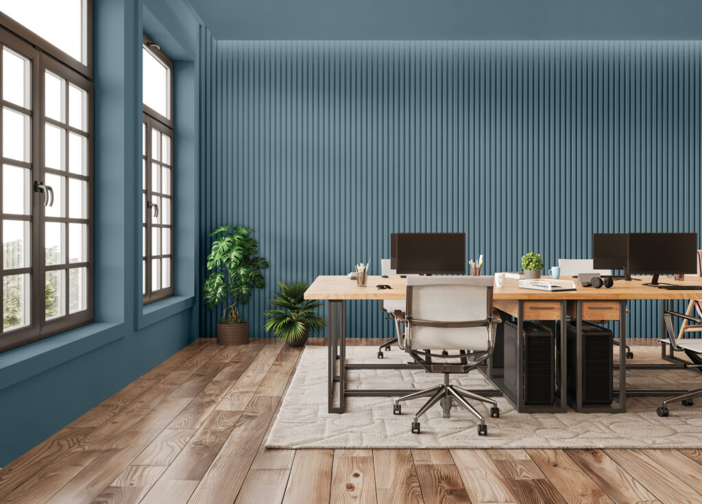
A warm, smoky blue, Artifact brings a steady sense of calm to both residential and commercial spaces, emphasizing authenticity over perfection. Homeowners and professionals are opting for colors that give them authorship over their own personal spaces. Artifact calls on them to draw on authenticity over perfection.
“Artifact invites reflection and calls us to pause, reassess and reconnect with what’s essential and gives meaning to our lives,” says Michelle Vincent, Pittsburgh Paints color and design manager. “Artifact creates balance without feeling flat. It is nostalgic, but not regressive, by pulling forward what was good from the past and reshaping it into something newly personal and curated. This color feels rare not because it is loud, but because it is used intentionally.”
Valspar | Cottage Door
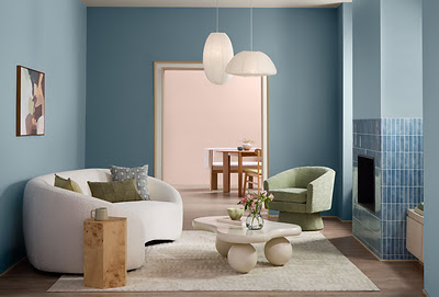
Cottage Door, a mid-tone neutral blue paint color blends warm and cool undertones. Balance Cottage Door’s grounded mood with the soft and joyful tones of Moon Shot and Apricot Blush. The warmth and optimism of these hues bring a gentle lift to any space. Together, these paint colors form a palette that speaks to emotional well-being, intentional living and subtle expression, while light wood tones enhance the authenticity of the look.
“Cottage Door celebrates the unique beauty inside us all,” says Sue Kim, director of color marketing at Valspar. “This mid-tone neutral blue is reflective and warm, with timeless appeal that feels personal and grounding. Cottage Door captures blue’s natural sense of security and trust while serving as a colorful new neutral that layers effortlessly into the home. It creates spaces that feel balanced, comforting and inviting.”
Home Hardware BeautiTone | Rosewater
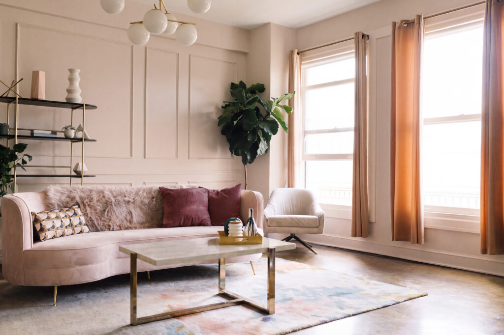
The soft, radiant pink balances comfort with sophistication, offering a fresh take on creating calm, lived-in spaces. Rosewater marks a shift from the deeper, moodier hues of recent years, including 2026 Color of the Year Muse, an earthy green, and 2025’s Midnight Flora, a dramatic red purple. For 2027, BeautiTone’s color experts are seeing a move toward softer hues that bring a sense of warmth and optimism into the home.
“Home is where we recharge, reconnect and find moments of calm amid busy lives,” says Donna Robertson, paint consultant, BeautiTone Paint and Home Products. “Across Canada, we’re seeing homeowners move away from stark, high contrast interiors toward colors that feel warmer, more approachable and enduring. Rosewater brings that warmth and softness into the home while maintaining a refined look that homeowners can build around for years to come.”
Behr Paint Company | Grounded
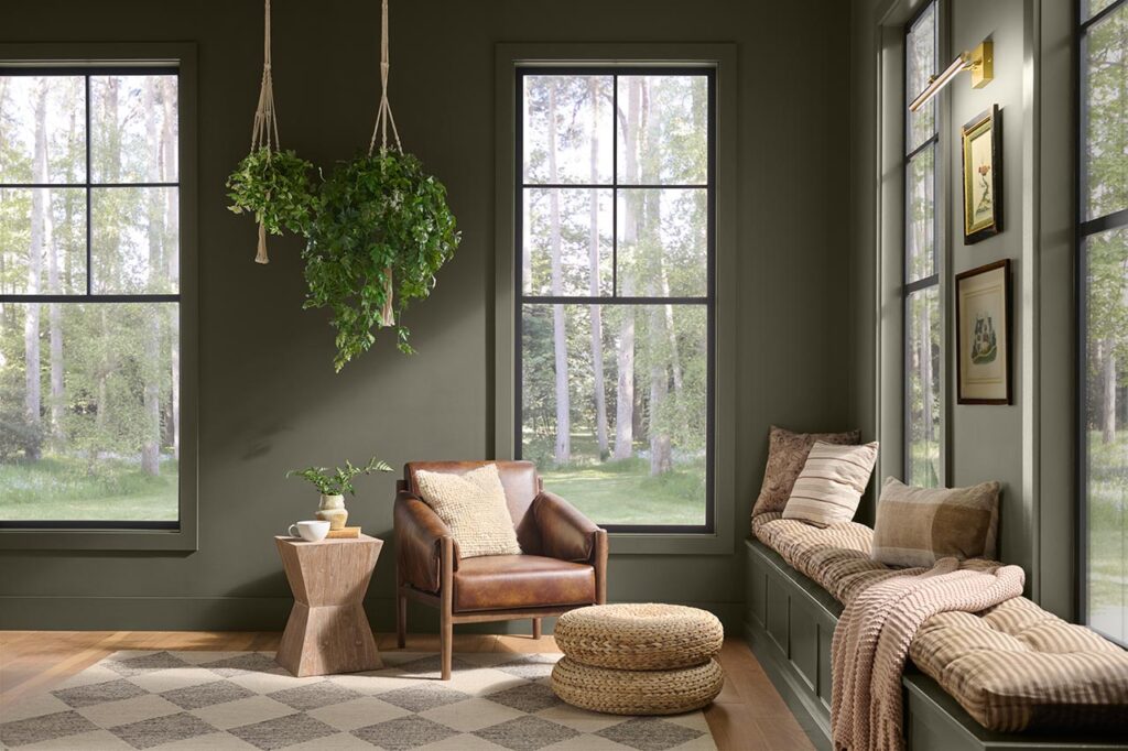
An earthy olive green that captures restorative essence and quiet energy, this natural shade moves effortlessly between olive and moss, anchored by subtle brown undertones that bring the outdoors in. Grounded is part of the BEHR® 2027 Color Trends Palette, a curated collection of complementary hues inspired by the beauty and balance of the natural world. Spanning warm neutrals, earthy tones, muted pinks, clay hues and airy blues, the palette offers endless versatility for creating layered, harmonious spaces.
“Grounded is a reminder that the most meaningful spaces are the ones that help us connect with the rhythms of everyday life,” says Kayla Kratz, head of color at Behr Paint Company. “The shade’s organic warmth creates a sense of calm and renewal, making every room feel inviting and effortlessly livable.”
Dutch Boy Paints | Deep Rooted
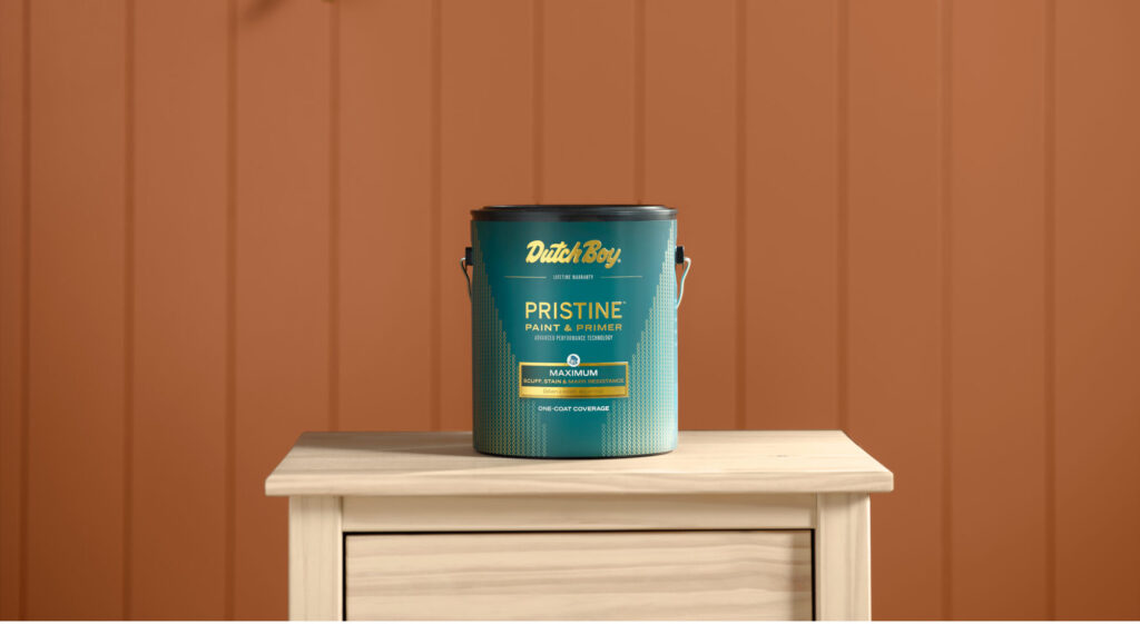
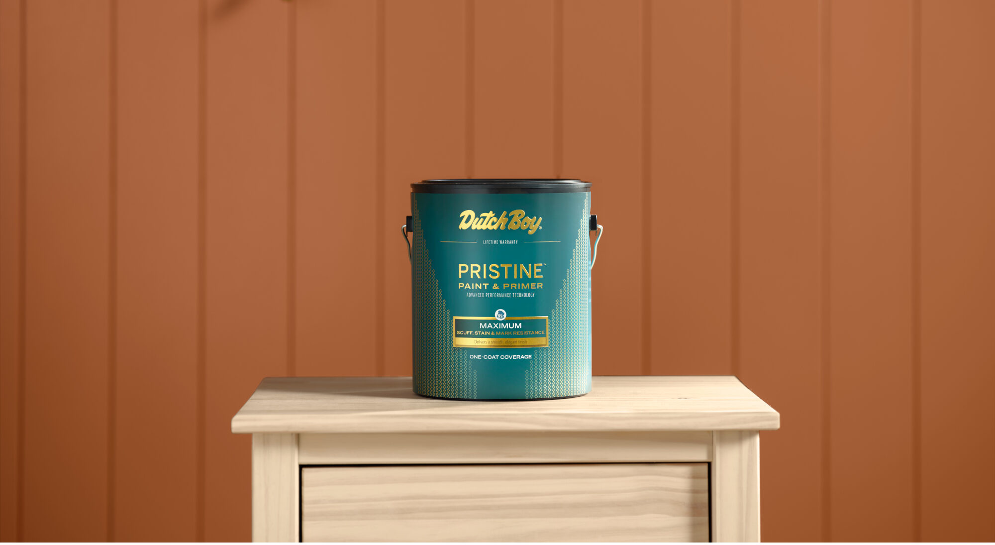
Inspired by the warmth of nature, Deep Rooted brings grounded optimism and comfort to a room, helping create a space that feels personal and effortlessly lived in. In addition to its Color of the Year, Dutch Boy Paints unveiled its full 2027 Color Trends Forecast, including three curated color palettes that showcase Deep Rooted’s versatility: the Essence Palette, Bliss Palette and Clarity Palette.
“Our 2027 Color of the Year feels alive with possibility while being rooted in the familiar warmth of nature,” says Lisbeth Parada, color marketing manager, Dutch Boy Paints. “Deep Rooted offers a color that feels rich, grounding and deeply human. Its earthy orange tone creates a versatile foundation for spaces that celebrate individuality through bold contrasts and layered textures.”