

With another Labor Day Long Weekend in the rearview mirror, most of us are looking forward to the beautiful landscapes and endless intake of pumpkin spice lattes that come only with autumn.
Wedged between the long lazy days of summer and the seemingly endless chill of winter, fall is a time of comfortable transition. The leaves change color, the air turns crisp and pumpkin patches abound.
The seasonal transformation, however, isn’t limited to the world beyond your front door. Surrounded by the natural beauty of fall, there’s no better time to pull out the weekend jeans, pick up a can of paint and throw down the drop cloth. In the spirit of the season, here are five fall-inspired colors sure to complement the most magical time of year.
Oranges
Conjuring up images of persimmons, apricots and pumpkins, orange can make for a healthy and vibrant addition to any space. Given its power and potency, however, the line between dynamic and brash can be thin. Particularly “loud” hues of orange are best applied in small doses and in contrast with lighter and more neutral tones, while softer shades can warm up dark spaces. Orange tends to work well in small spaces, such as breakfast nooks, offices or laundry rooms – and especially as a focal point or accent wall.
Yellows
From bright and sunny to pale and buttery, there are countless shades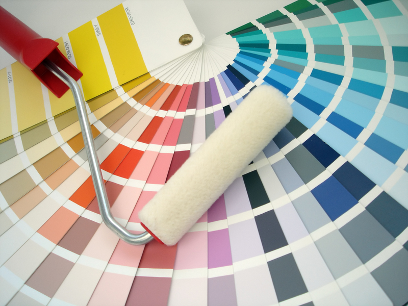 of yellow to choose from – and each can transform a room from boring to beautiful. If you’re going for a calming effect in a large space (such as a kitchen or a living room), try something warm and soothing; if you want to cheer things up with a burst of color, use a smaller dose of something closer to lemon. The best thing about yellow is that it can work with dark and creamy colors alike.
Reds
Whether it’s maple leaves lighting up the countryside or candy apples at a county fair, it’s hard to escape the color red in autumn. Vivid and intense, red can walk the tightrope between bold and overbearing, but when used correctly it can virtually reinvent a room. Perhaps more than any other color, red requires careful attention in relation to the colors it will be complementing, as it can really darken up a room. A general rule of thumb with red is that less is often more – especially in small spaces.
Browns
The idea that brown is somehow synonymous with boring couldn’t be further from the truth. As the days become shorter and the temperature cooler, a warm, rich tone of brown can be just what your home needs to move into autumn. But whether you decide on a subtle beige, a milky chocolate or a dark espresso, the beauty of brown is that nearly every shade is versatile enough for any room – and every season. While it’s equally elegant on its own as it is with a pop of color, brown goes great with a few of our other favorite fall colors – especially with vivid splashes of yellow and orange.
Plums
Sophisticated and romantic, plum is the perfect color for fall. With their healthy balance of blue, red and grey, most hues of plum evoke elegance and comfort while adding a pop of contemporary style. As darker shades can be risky in small rooms, plums often work best in spaces with lots of natural sunlight. Its versatility and timelessness also makes it perfect for adding pizzazz as an accent color with creamy whites and dark browns alike.


