

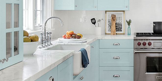
Every retailer has heard the old adage that says you don’t sell paint cans, you sell color. In 2021, that notion may never be more important when serving your customers.
Throughout 2020, e-commerce for home improvement products grew, but paint proved particularly resistant to online sales. For many shoppers, seeing color options in person was a critical motivator for visiting paint and decorating outlets in person.
According to retail sales projections from the Home Improvement Research Institute and research firm IHS Markit, the paint and sundries market grew 10 percent from 2019 to arrive at $23 billion in annual sales last year. Taking stock of major paint manufacturers’ color of the year selections can help you introduce new color trends to customers. From a sales perspective, you can leverage their national marketing campaigns highlighting these new color options to boost sales at your own store.
On the following pages, explore the brilliant highs of 2021 color of the year selections to learn how paint makers’ color outlooks could both inspire customers and boost sales at your operation.
Click here to learn more about how to connect with customers and view a wealth of free and premium training resources to improve your team’s selling skills.
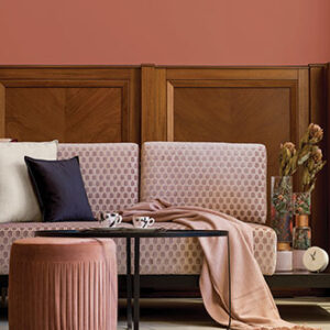
Benjamin Moore
 Aegean Teal
Benjamin Moore named Aegean Teal 2136-40 as its 2021 color of the year selection that sought to celebrate memories made in homes across the world.
“Amid uncertainty, people yearn for stability. The colors we surround ourselves with can have a powerful impact on our emotions and well-being,” says Andrea Magno, Benjamin Moore director of color marketing and development.
In addition to the blue-green hue, the company also named 11 supporting colors as part of its Color Trends 2021 palette.
“Aegean Teal 2136-40 and the corresponding Color Trends 2021 palette express a welcoming, lived-in quality that celebrates the connections and real moments that take place within the home,” Magno says.
Diamond Vogel
 Dreaming of the Day
Diamond Vogel has announced Dreaming of the Day as its color of the year selection for 2021, explaining the blue-green shade invites feelings of relaxation and calm.
“‘Dreaming of the Day’ offers a harmonious feel, an awakening to a more relaxed state of mind,” says Sandy Agar-Studelska, Diamond Vogel marketing manager. “This muted blue-green harkens a feeling of nature, clarity and a desire for wellness and healthy living.”
Agar-Studelska says disruption brought by COVID-19 influenced the 2021 color selection.
“After a long period of quarantine, separation and our desire for connection, we all dream of the day we can return to family, share a direct smile and participate more freely within our community and more fully in life,” she says.
Diamond Vogel also released a 2021 Color Trend Report called “Comfortable, Nurturing and Optimistic.” It includes 20 colors in four trend palettes which provide inspiration for customers’ desires to stay healthy and strong.
Glidden
 Aqua Fiesta
Glidden, a subsidiary of PPG, has chosen its first accent color of the year for 2021. Aqua Fiesta is a cheerful and fresh aquamarine color that works well as a complement in bedrooms, bathrooms, living rooms and kitchens.
Amy Donato, marketing manager for Glidden, says Aqua Fiesta pairs well with the company’s 2020 color of the year selection, the calming gray Whirlwind.
“Last year, we already knew that Whirlwind would be a staple color for 2020 and beyond, and the anxiety of this year has only made people crave this no-frills gray even more. We have gone one step further to help you stop ‘procrastipainting’ by unveiling Aqua Fiesta as the go-to accent color. Now, it’s time to put down that homemade banana bread and pick up a paint brush,” Donato says.
She says paint and decorating retailers can help customers achieve a truly comforting space by recommending Aqua Fiesta in tandem with lush white fabrics and comfortable pillows.
Kelly-Moore
 4 Main Color Trends
Kelly-Moore is highlighting multiple colors as trending options for 2021, says color marketing manager Shannon Kaye. She says emerging color trends balance comfort, reassurance and focus in the new year.
Kaye says the Kelly-Moore team initially focused on a single color to define 2021: a red-based blue called Cloudy Day. However, the company noticed several emergent trends that reflected the diversity and opportunity of a new year.
Alongside Cloudy Day, Kelly-Moore is monitoring Ocean Cruise, which balances deep greens with a subtle gray undertone. The company also saw an appreciation for California Chamois, a golden yellow that invokes confidence and energy, Kaye says. Clay colors also represented a strong design path, and Kelly-Moore is also highlighting Himalayan Salt to offer stability and warmth in uncertain times.
“We’re seeing a move away from white, impersonal rooms with a surge in feature walls, accent colors and lots of creative painting projects filling the social media wave,” Kaye says. “We couldn’t be more thrilled and hopeful about people embracing color and individual expression in the new year.”
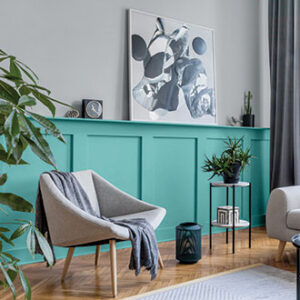
Pantone
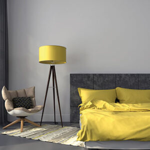 Ultimate Gray & Illuminating
Though Pantone doesn’t manufacture paint, keeping tabs on the company’s dual color of the year selections for 2021 can help you engage customers looking to highlight new decorating trends at their homes or offices.
Pantone selected Ultimate Gray and the lively Illuminating as its 2021 colors of the year, with Pantone Color Institute executive director Leatrice Eiseman saying the two options work in harmony.
“The union of an enduring Ultimate Gray with the vibrant yellow Illuminating expresses a message of positivity supported by fortitude,” she says. “Practical and rock solid but at the same time warming and optimistic, this is a color combination that gives us resilience and hope.”
Eiseman says combining the two shades in table linens, sheets and home accessories conveys a welcoming message and is ideally suited for offices, where the shades invoke feelings of curiosity, originality and resourcefulness.
PPG
 ‘Be Well’ Color Palette
Instead of a single color of the year, PPG has unveiled a 2021 color palette called “Be Well.” The calming collection includes three main hues: Transcend; Big Cypress and Misty Aqua.
“With the world sheltering in place for the better half of the year, we have begun to crave human connection and embrace simple activities, including walking, hiking, baking and gardening,” says Dee Schlotter, PPG senior color marketing manager of architectural and industrial coatings. “This organic and hopeful palette represents what we have been longing for after decades of overstimulation and overconsumption—simplicity and restfulness.”
Specifically, Transcend is a midtone oatmeal-colored hue that is reminiscent of earthy colors. Big Cypress, a robust ginger color with persimmon undertones and Misty Aqua, a cerulean blue, provide an unexpected pairing that denotes freshness against warm, natural tones.
York Wallcoverings
 Blue Jean Denim
In a year when many sought comfort, York Wallcoverings announced Blue Jean Denim would be its 2021 color of the year selection to symbolize the timeless comfort of the fabric.
“From an aesthetics perspective, it’s a beautiful color found in many of our most popular wallcoverings, and we’ve seen a big shift toward styles that evoke feelings of comfort and casual togetherness at home,” says Carol Miller, York’s in-house trend and color expert. “There have been a lot of challenges this past year, and looking into 2021, people are craving spaces that provide relaxation—similar to the familiar happiness you get from wearing your favorite denim jacket.”
Miller says choosing Blue Jean Denim as York’s color of the year represents a return to comfortable, cozy interiors.
“It feels very right to recognize Blue Jean Jacket as emblematic of strength, warmth and the centerpiece of a confident tomorrow,” Miller says.
3 Ways to Leverage Colors of the Year
Every year, paint and coatings manufacturers and color authorities select the hues they think encapsulate the customers’ moods and style preferences. Retailers should be familiar with colors of the year and understand how to sell them when a customer comes looking for inspiration. Here are three ways to make the most of popular colors of the year selections.
- Be Complimentary
Over the last few years, it’s become more common for companies to announce multiple colors of the year or entire palettes in some cases, which can help you show your customers how to use families of color to update their spaces. Understanding a color of the year’s complementary companions can boost your add-on sales.
- Find the Value
A common tip for people selling their homes is to freshen up the paint before prospective buyers come through the door. It’s important for you to be able to coach people on how to maximize the appeal of current trends while also maintaining a neutral palette to ensure it’s ability to sell. Using a trendy color as an accent can help highlight a home’s modern appeal to buyers. - Bring It Home
While in-home consultations may not have been easy this year, you can still help customers in their homes. If a customer asks for a sample, be sure to guide them through the process—the larger the swatch, the better the test. Also consider hosting Zoom consultations so you can get a better sense of someone’s style before recommending colors, patterns and accessories.
