It’s official – the beloved summer season has arrived, and all of us here at PDRA couldn’t be happier!
While most people spend their summer days lazing around at the cottage or the beach, some use the downtime to spruce up their properties. As you know, the summer months make a great time to paint because open windows and fresh breezes can reduce fumes and cut drying time in half!
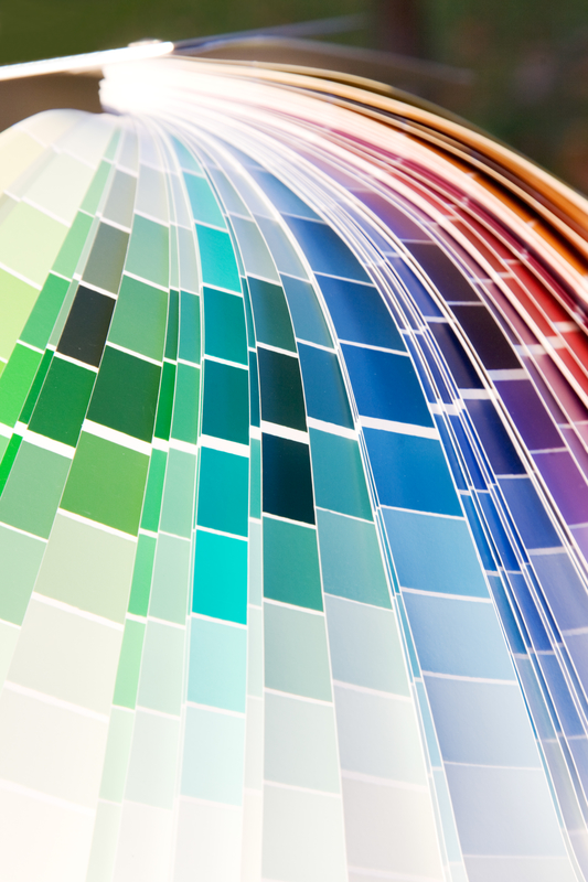
If your customers are looking to add a splash of color to their homes this summer, here’s a list of the season’s hottest paint trends.
Pretty Pinks. Once reserved solely for little girls’ bedrooms, pink is making a major splash in décor circles this summer. Fresh and warm, Florida Pink by Benjamin Moore will absorb all of the bright summer sunshine that beams through the windows. While it’s soft enough to use throughout an entire room, incorporating a crisp, white trim will help make the color pop and remain visually balanced.
Light Greens. The color green is definitely trending in 2016, and light shades are widely seen as the most stylish and versatile for the season. A nice contrast from the warm tones that are typically associated with summer, Benjamin Moore’s Potpourri Green and Mellow Mint by PPG act as complimentary backdrops for natural decor like freshly-picked flowers and greenery from the garden. To make the earthy tones stand out more, we suggest using a natural wood trim or baseboard.
Coastal Blues. As one of the most beautiful shades in Benjamin Moore’s repertoire, Santa Monica Blue evokes feelings of calmness and serenity, which is perfect for the relaxing summer season. Reminiscent of the deep waters found on a tropical island, coastal blues can transform your home into a warm beach house with a single stroke. When paired with high-contrast shades like coral or turquoise, guests will feel like they’ve walked into a luxurious Caribbean resort.
Muted Violets. Soft and luxurious, muted purples resemble the fresh flowers that could be found in a blooming summer garden. Perfect for a variety of rooms including the kitchen, bathroom or bedroom, understated violets look best when used as a stand-alone with a simple white trim and ceiling. No matter where you use them, shades like Lavender Haze by PPG are neutral enough that the can be carried over for the rest of the year.
Bold Berries. Nothing says summer like fresh fruit, so why not add a blast of bright berry-colored paint to your décor? While bolder shades like bright red or dark blue can add a refreshing splash to any room in your home, however, they are usually most effective in small doses – or as accent colors. For those feeling adventurous this summer, you can’t go wrong with PPG’s Wild Mulberry or Berry Fizz by Benjamin Moore.


